ANZ Gothic Bank: Creating a font & applications
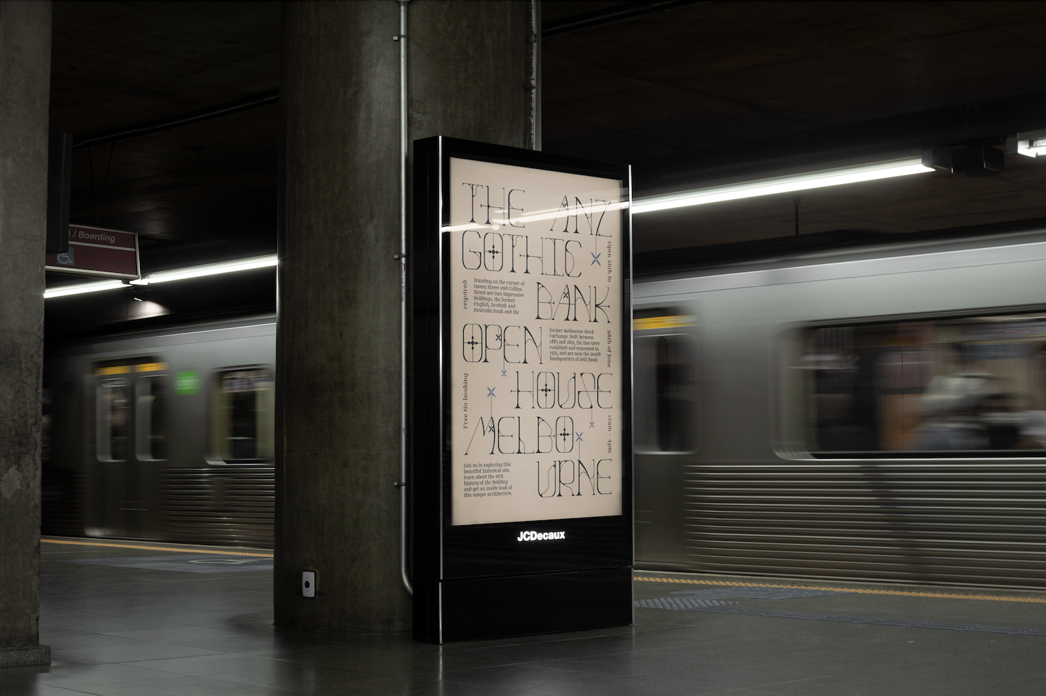
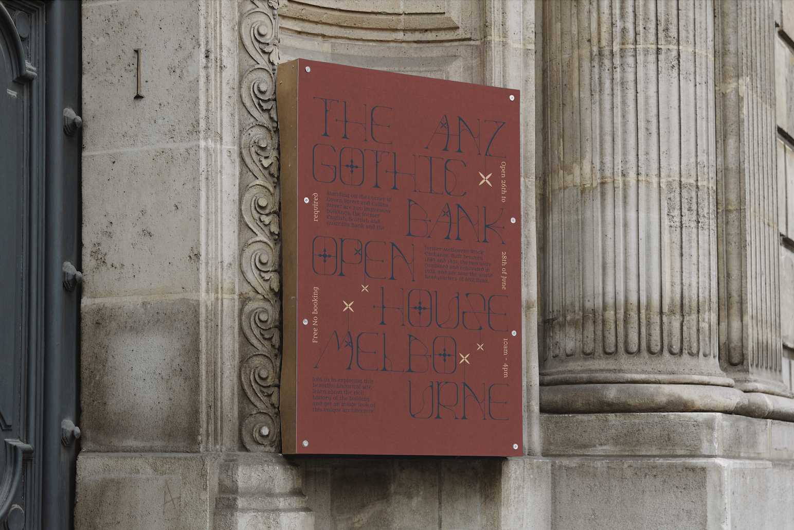
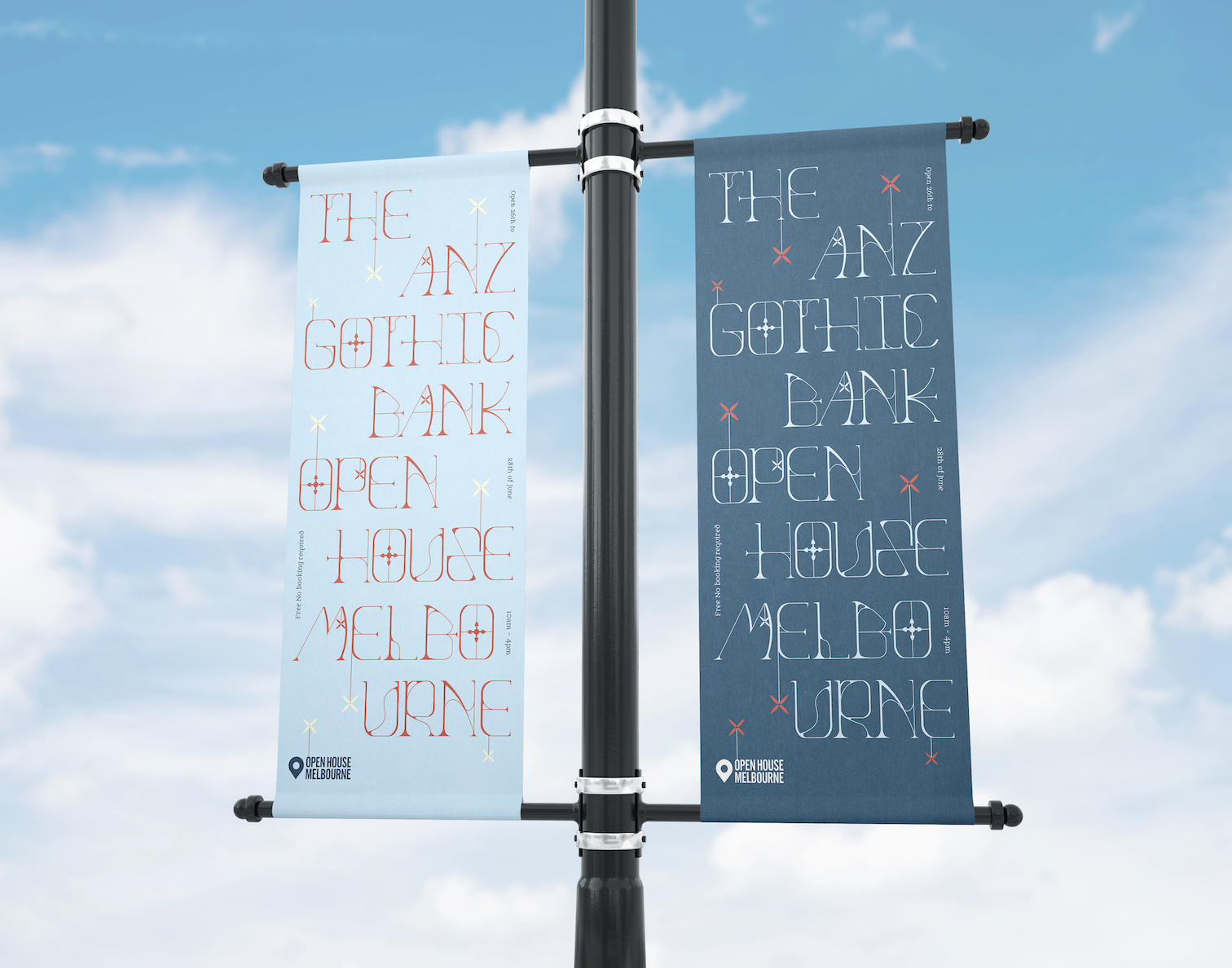
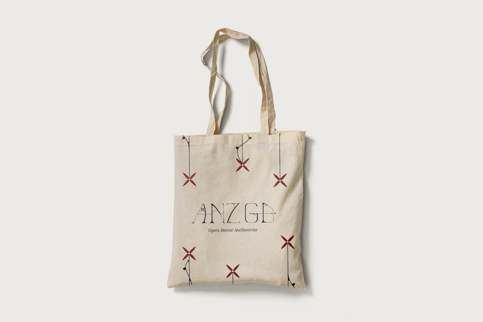
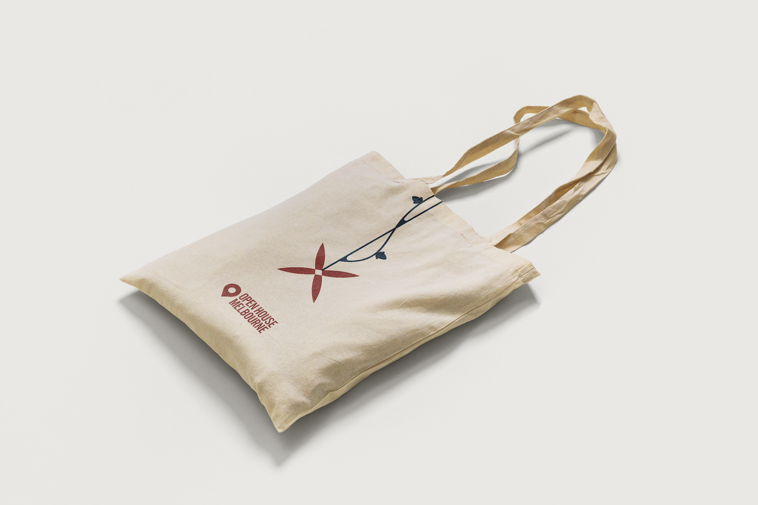
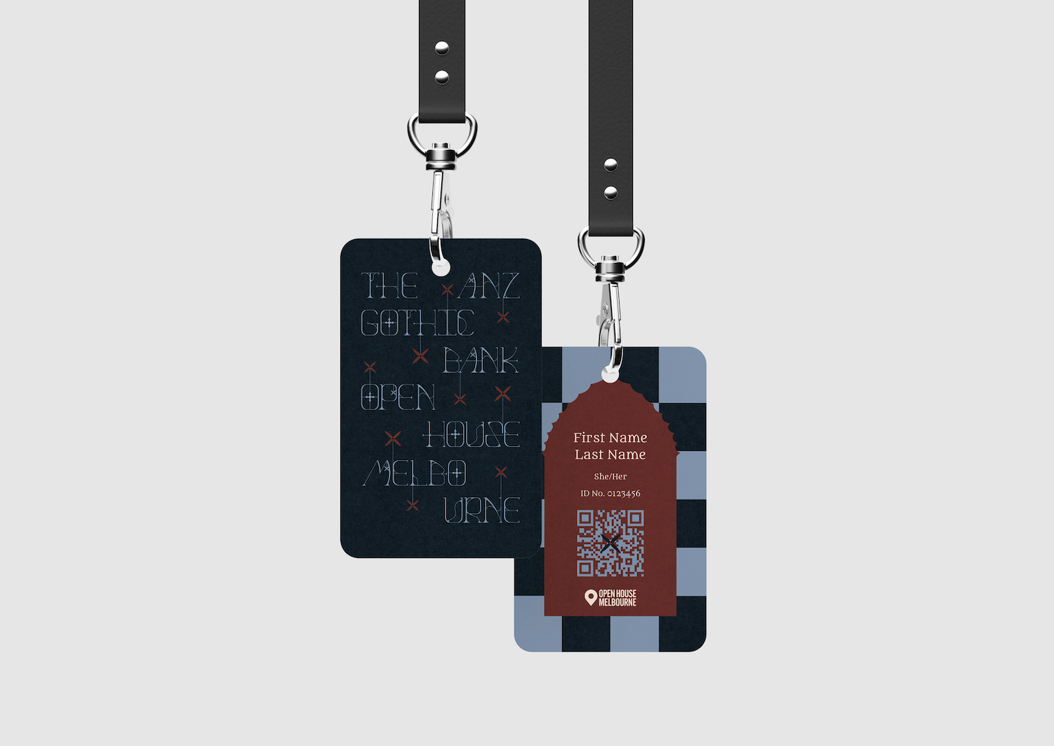
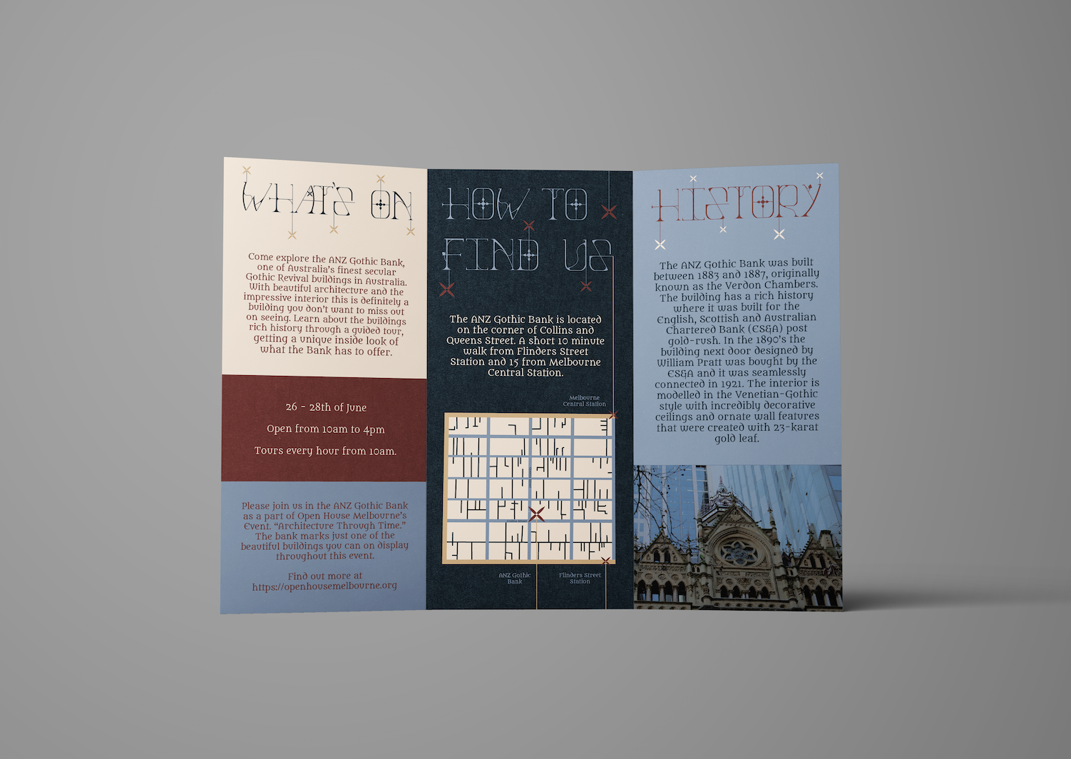
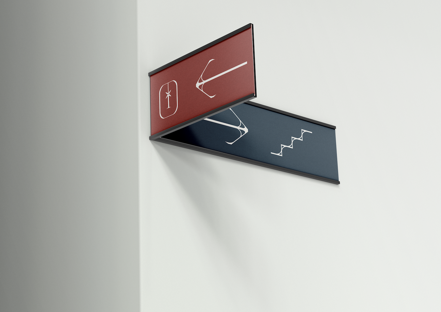
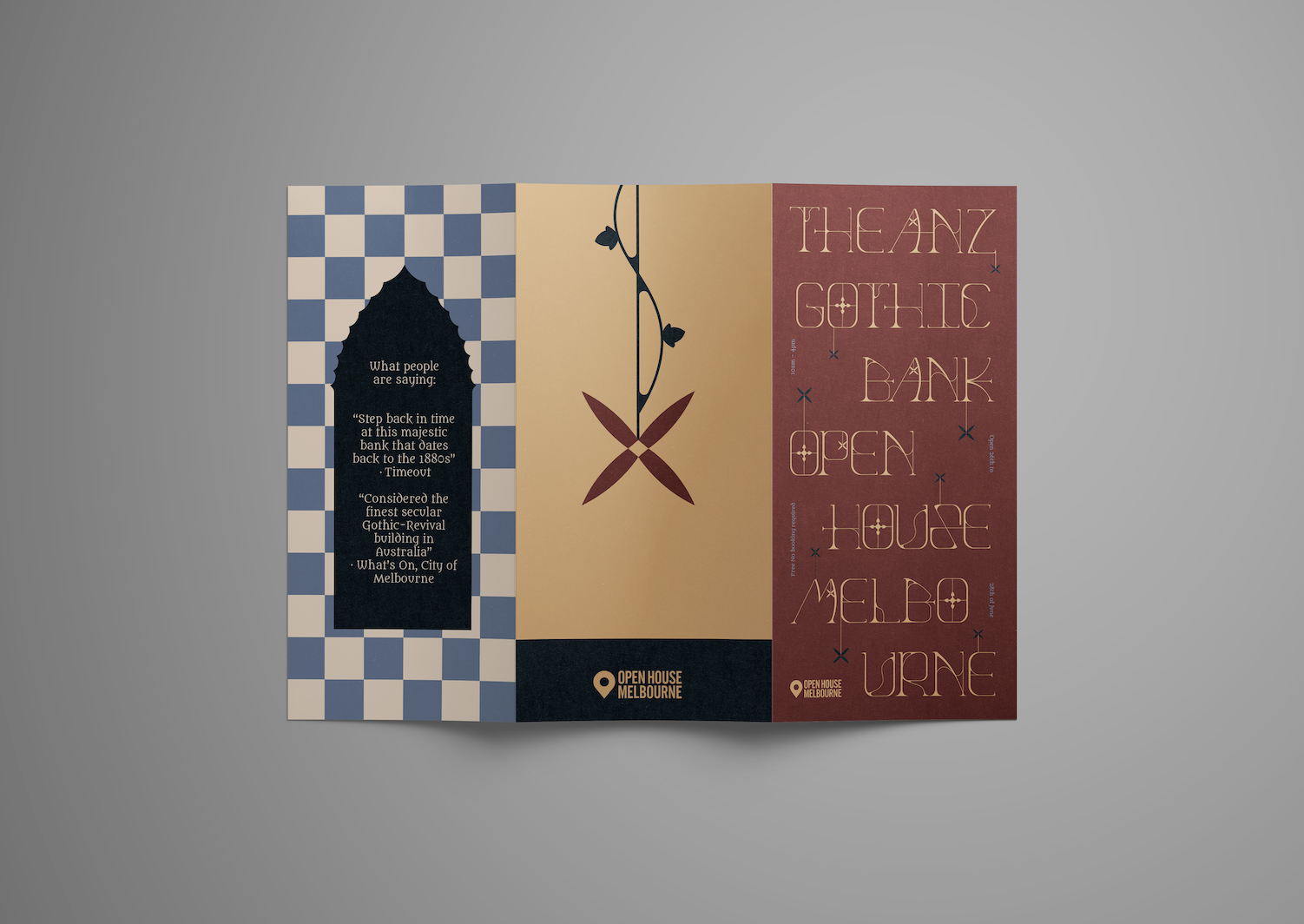
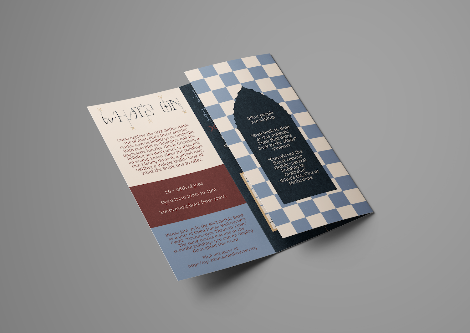
This assessment tasked us to develop a typeface based on a building and then create applications to highlight our work. I chose the ANZ Gothic Bank as Gothic architecture has details that interest me greatly. I decided that I did not want to go in the direction of a ‘classic’ Gothic font and instead wanted to create an ornamental type that is derived from the impressive filigree and unique crockets. I chose a capital typeface to ensure the details could be properly captured. I took photos of the building and then studied the designs to create my modules and serifs. The aim was to reflect the age and beauty of the building.
Skills Utilised:
Adobe Photoshop
Adobe Illustrator
Brand Identity
Typography Design
